You shipped three features this week. Great. Can someone who signed up on Monday actually use the first one?
That is the part I keep coming back to with AI. We spend a lot of time discussing how much faster we can build. Less time discussing how much more work we are giving the person on the other side of the screen.
They still have to understand the product. Set something up. Decide whether to trust the result. Explain it to a colleague. Sometimes get permission before they can do anything useful.
None of that disappears because the feature took two days to build.
I lead product design and I’m building Cueston, a product for in-app guidance. So yes, I have a commercial interest here. But I also think we need to be more honest about what guidance can fix, what activation actually means, and when an upgrade message becomes somebody else’s problem.
Attract users to something they can actually finish
Take a reporting product. The homepage says it helps managers stop spending Friday afternoon preparing updates. That is a decent reason to try it.
The person signs up. We ask for their job title, company size, phone number, team name, preferred dashboard layout, and whether they want to invite colleagues. Then we show them an empty dashboard.
Somewhere between the ad and the product, Friday’s report got lost.
I would build acquisition around that actual job: turning existing data into a report someone can share. Show the input, the work, and the output in a short demo. Write about the problems people encounter doing it. Make a template they can use. Let the landing page explain what setup is required before asking them to commit.
There is room for comparison pages too, but “cheaper alternative” only gets you so far. Explain which workflow you handle well, what switching involves, and where your product has limits.
Then carry that promise into the first session. If the visitor came for a weekly report, put a weekly report within reach. Use sample data when connecting real data takes time, while making it obvious that the result is a preview.
This is why I would look at acquisition cost alongside activation by source. A campaign can produce cheap signups from people who will never get the outcome your product offers. The signup number alone hides that.
Define user activation before you redesign onboarding
“Completed onboarding” is too vague to be useful. What did they complete? Five screens? A profile? An actual piece of work?
For our reporting example, a candidate activation event could be: an eligible workspace creates a report from its own data and shares it with a colleague within seven days of signup.
That is a hypothesis. We still need to check whether workspaces doing this are more likely to come back and use reports again. A behavior that correlates with retention gives us something to investigate; it does not prove that forcing everyone through it will improve retention.
The unit matters too. A manager may create the report while someone else connects the data. Measuring those people as separate failed users would give us a strange picture of a successful account.
I would write down four things before touching the welcome screen: who we are measuring, what useful outcome counts, when the clock starts, and how long they have to reach it.
Amplitude’s activation guidance also makes room for the return visit. First value is useful evidence. Coming back to get that value again tells you more.
Measure time to value without hiding the people who got stuck
Time to activation is the elapsed time between the starting event and the activation event you defined. Time to value is about when the person receives a useful result. Those can be the same moment, but they do not have to be.
A preview built with sample data can explain the value in a minute. Getting approval to connect a company’s real data might take three days. Both experiences matter, for different reasons.
I would track the median and a slower percentile, such as p75, alongside the percentage that activates within a fixed window. Always keep the people who never activate visible in the conversion rate.
Otherwise you can make time to activation look better by losing the slower users. Congratulations, the dashboard improved and the experience got worse.
For a seven-day activation rate, compare signup cohorts that have had the full seven days. Break them down by role, use case, and acquisition source where you have enough data. Keep the definition stable while testing a change.
Then look at the actual delay. Are users confused? Waiting for another person? Missing data? Facing an integration error? A tooltip will only help with some of these.
A user tour should help someone finish a task
I’m building a product that includes tours, and I still don’t want a tour of every button when I open software.
If I came to create a report, help me create the report. Point out where to choose a source when I reach that step. Explain a confusing option next to the option. Let me skip the guidance, and let me find it again later.
A short tour makes sense when a task has unfamiliar steps that need to happen in order. A checklist can help when setup spans several sessions. A tooltip can explain one decision. Sometimes a better label or empty state removes the need for any of them.
Nielsen Norman Group’s discussion of onboarding and contextual help is useful here: information presented before someone needs it puts a burden on their memory. Help becomes easier to apply when it appears in the relevant context.
So I would stop a report-creation tour when the report is created. I would not make the person click through three more feature announcements to earn a completion badge.
Tour completion is a diagnostic. Task completion is the outcome we are trying to improve.
User learning continues after the first session
The first report might be basic. Next week the manager needs a filter. Later they need to schedule delivery. Eventually another team wants its own version.
That is a much more useful learning sequence than showing all four capabilities on day one.
You can respond to the person’s progress. Offer scheduling when they are repeating a report. Introduce collaboration when they start sharing. Explain a changed control when they return to the affected screen.
Also remember what they already know. Repeating a welcome tour after every release is exhausting. Guidance needs completion rules, dismissal rules, and sensible limits on how often it appears. Several teams owning separate banners can still create one very annoying product.
The test I like is whether the person can do the task again with less help. If they need the same explanation every time, we should look at the interface and the task itself.
PLG upsell needs a reason that makes sense to the user
Product-led growth gets awkward when the product is trying to teach, sell, and announce something in the same moment.
The reporting example gives us a reasonable expansion opportunity. Someone is producing the same report every week. Scheduling could save them work. If scheduling is a paid capability, that is a relevant place to explain it.
I would make the offer specific: “Send this report automatically every Friday. Scheduling is included in Pro.” Let them inspect the setup and understand the plan before deciding. Keep the manual workflow usable if that is part of the free offer.
An upgrade message on first login has much less context. The user has barely seen a result, and we are already asking them to value the advanced version.
In B2B, the person doing the work may not be allowed to upgrade. Give them a way to involve the owner with enough context to make the request useful. Don’t keep showing a payment button they cannot use.
Measure paid conversion among eligible accounts, then check whether those accounts use the capability and stay. An upgrade followed by immediate cancellation is a poor reason to celebrate the prompt.
Reducing support tickets starts with understanding the question
“Where do I export this?” and “The export is missing half my records” may arrive in the same support queue. They need different fixes.
The first might need a clearer action or contextual help. The second needs investigation. Teaching someone to work around a broken export does not fix the product.
I would group repeat questions by the task, the point of failure, and the likely cause. Then choose between a product change, guidance, documentation, or a better route to a person.
Measure onboarding questions per 100 new workspaces, or task-related questions per 100 task attempts, depending on the problem. Raw ticket count is hard to interpret when usage changes. Pair it with completion, abandonment, and resolution quality.
People who leave without asking for help also reduce your support volume. We should probably avoid calling that a win.
Where AI is actually useful
I see two different jobs for AI here: helping the team maintain guidance, and helping the user complete work.
For the team, the opportunity is practical. Draft a flow for a specific audience. Check the target elements. Preview it on the product. Review the language. Fix guidance when the interface changes. Investigate where people leave.
That is the direction I’m building toward with Cueston. Its MCP integration lets an AI agent inspect workspace context, draft guidance, validate it, and generate a preview for review. The dashboard, CLI, and API give teams other ways to work with the same product.
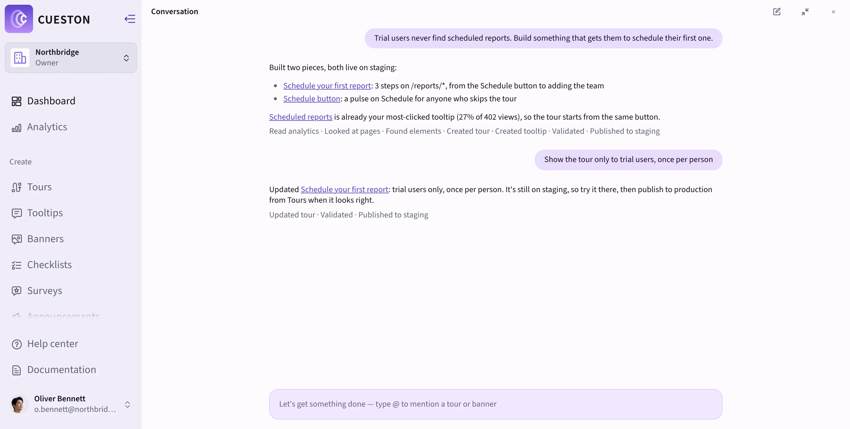
For example, I would start with a request like this:
Build a draft for new workspace admins creating their first report. Use the pages and elements available in this workspace. Keep it focused on that task, check the targets, and show me a preview before publishing. Tell me if the audience needs an event or attribute we haven’t supplied.
The last sentence matters. An agent needs reliable context. If we haven’t told the system which users created a report, it shouldn’t pretend to know.
For the end user, AI can help explain a decision or prepare work, provided the product supports that safely. When it takes an action, people need to see what happened, review important consequences, and recover from mistakes. A confident answer with no useful next step is still a support problem.
I don’t think the aim should be to generate more onboarding content. We already have enough things competing for attention. I want the team to spend less time maintaining explanations and more time finding the point where someone gets stuck.
Start with one journey you can measure
Pick one audience and one useful outcome. Watch where people stop. Fix the obvious product problem first. Add guidance where explanation is genuinely needed. Compare the result against a baseline, or a randomized holdout when the volume and setup allow it.
Check activation, time to value, repeat use, and related support requests. Then test the next improvement. If several things change at once, be careful about which one gets the credit.
This is the work I want Cueston to make easier: helping teams build and maintain guidance close to the task, with a way to see what people do afterwards.
If you want to try it, start with Cueston and choose one flow where new users regularly need help. One flow is enough to find out whether your guidance is doing useful work.
The next time we celebrate how many features shipped, I’d like us to bring another number to the conversation: how many more people managed to do the thing they came for.